The Branding Challenge
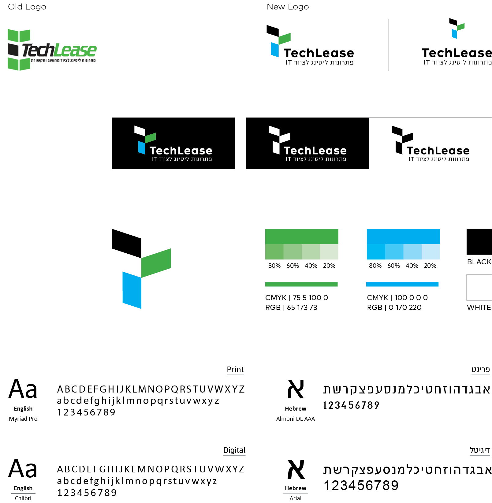
In a few words: The challenge was to take the existing brand forward to the present-future.
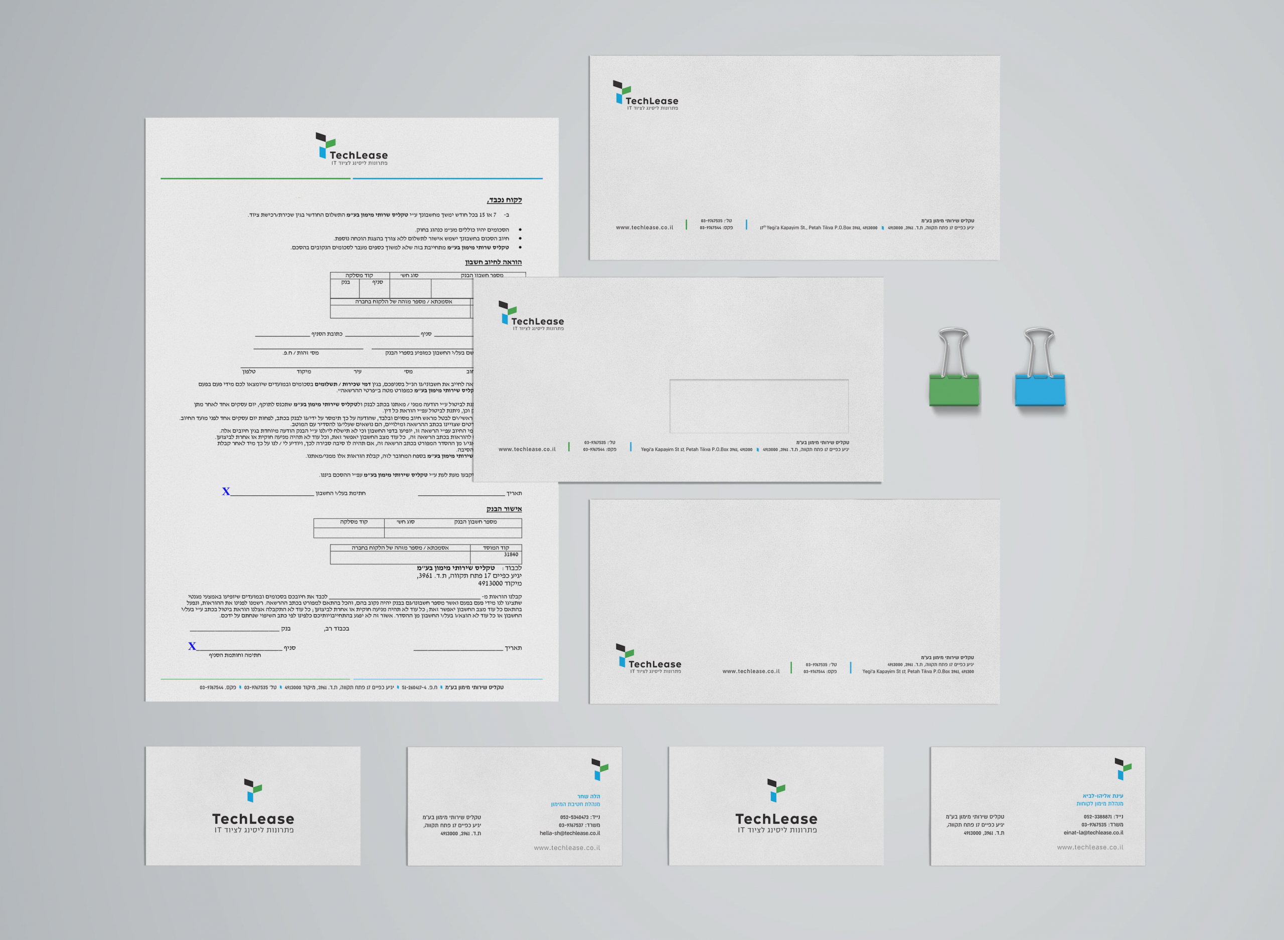
TechLease deals with both Finance and IT business.The idea was to find a visual language that combines them both and has some kind of reference to the original logo and colors used in the past years.
The logo symbol reflects the T letter in an innovative unique and identified way, built with 3 computer screens shapes.
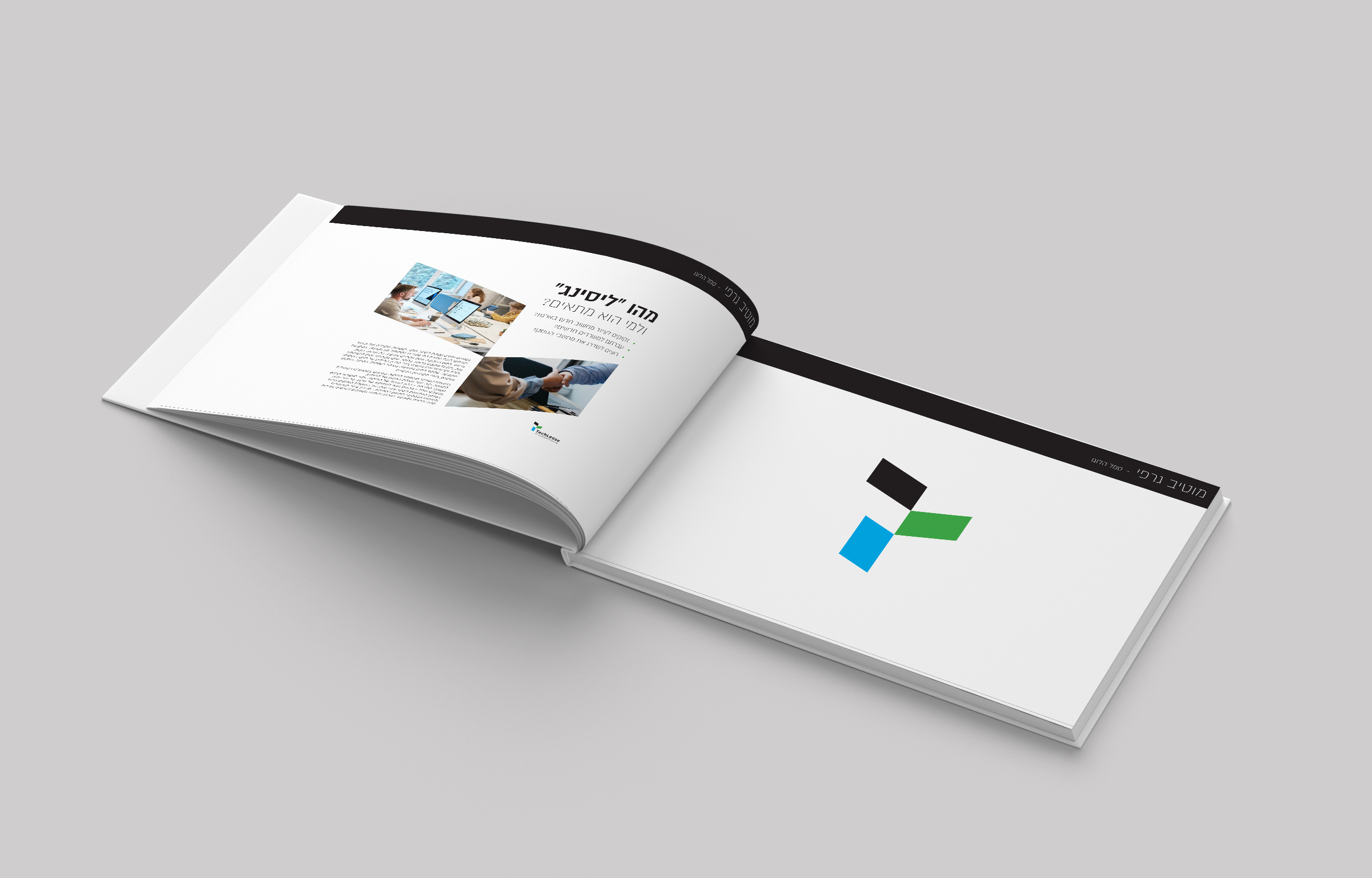
Company Profile
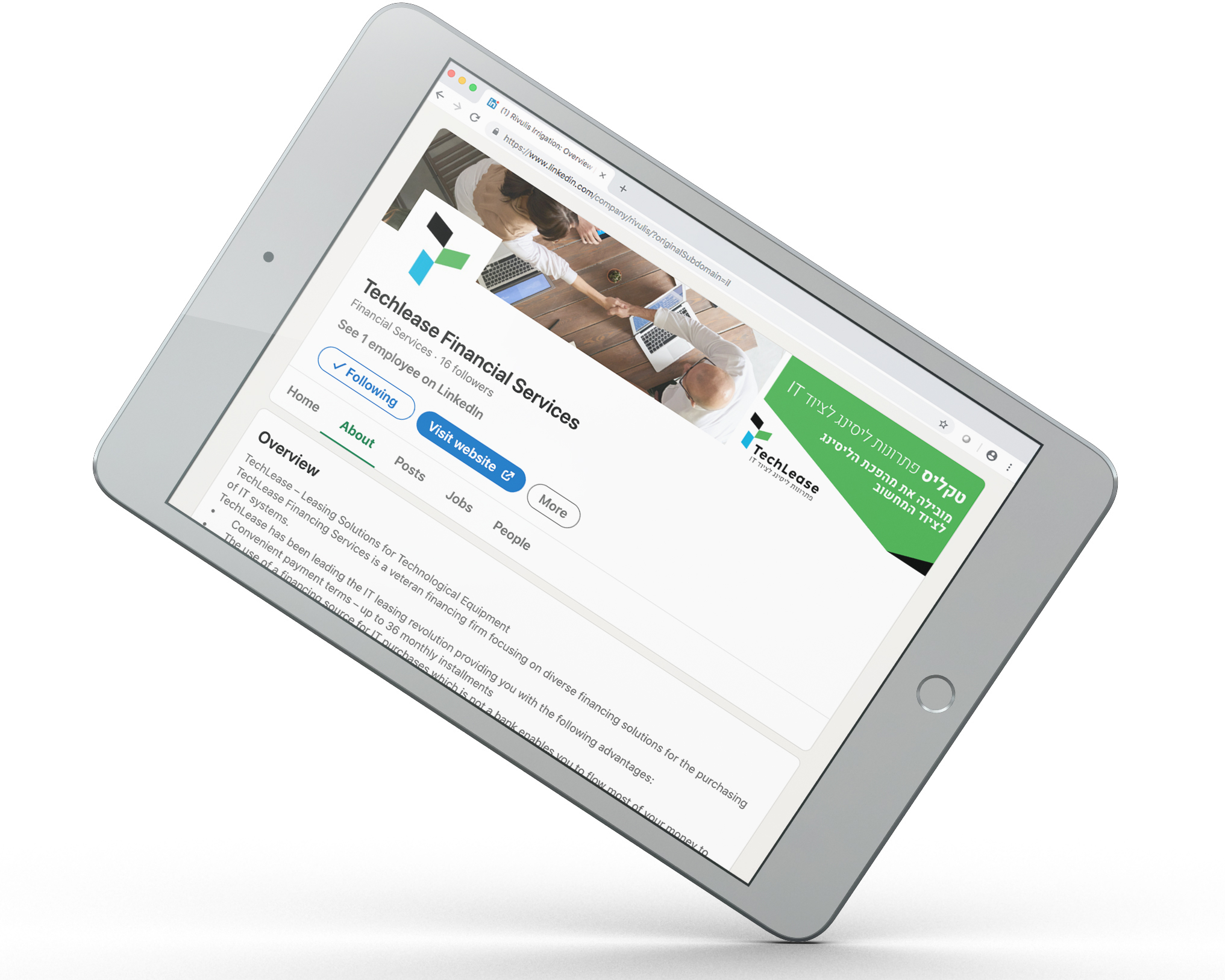
Social Networks Profiles

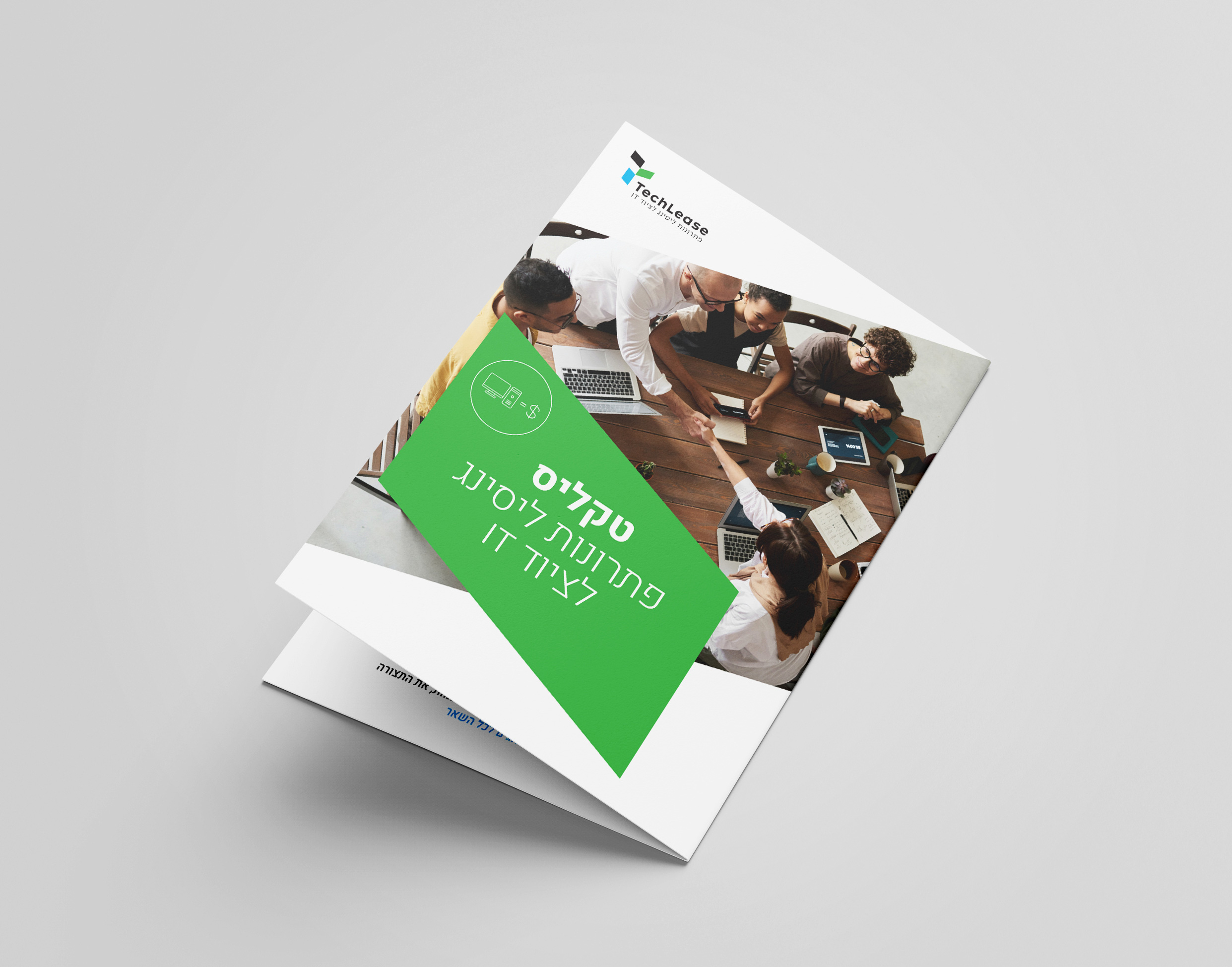
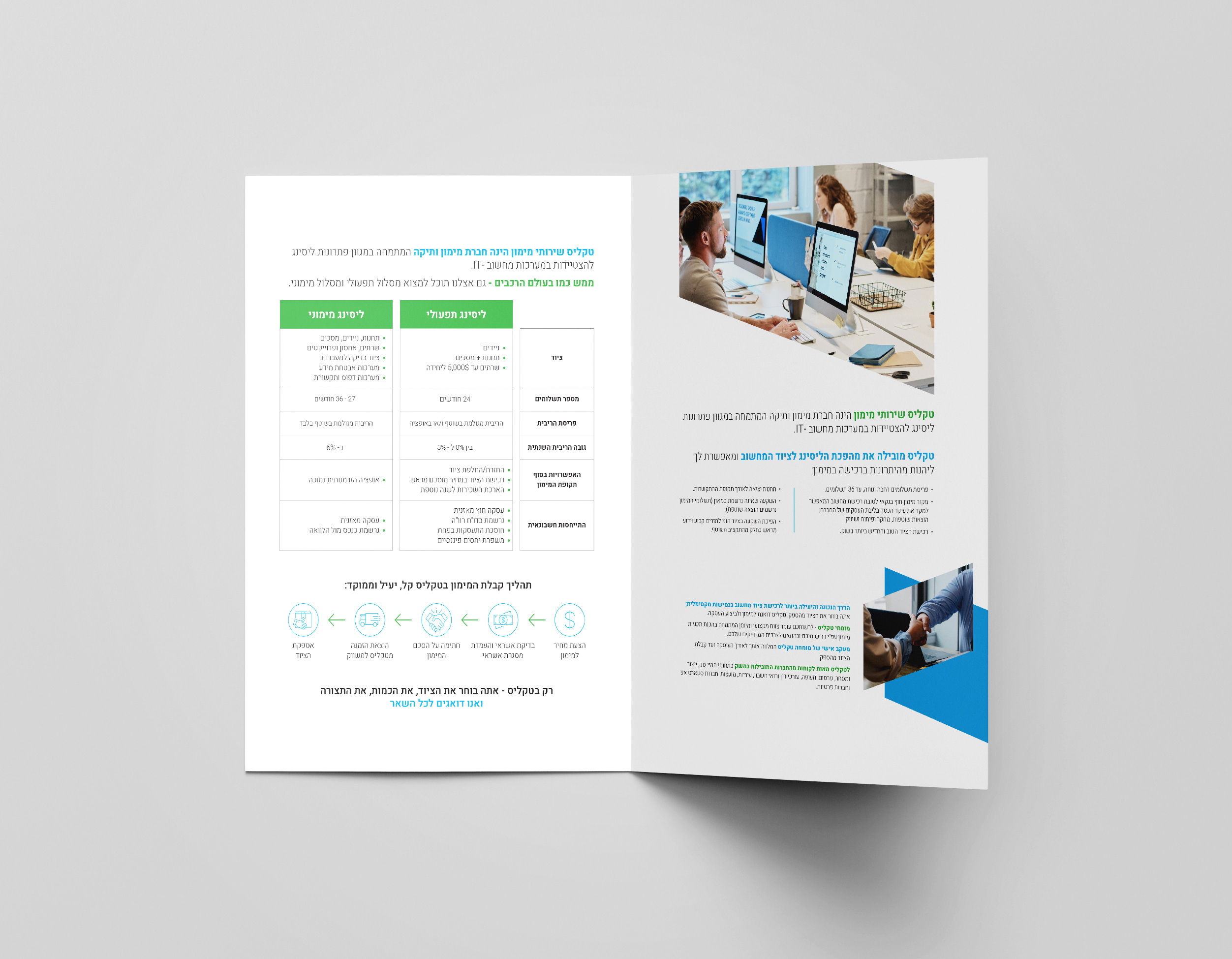
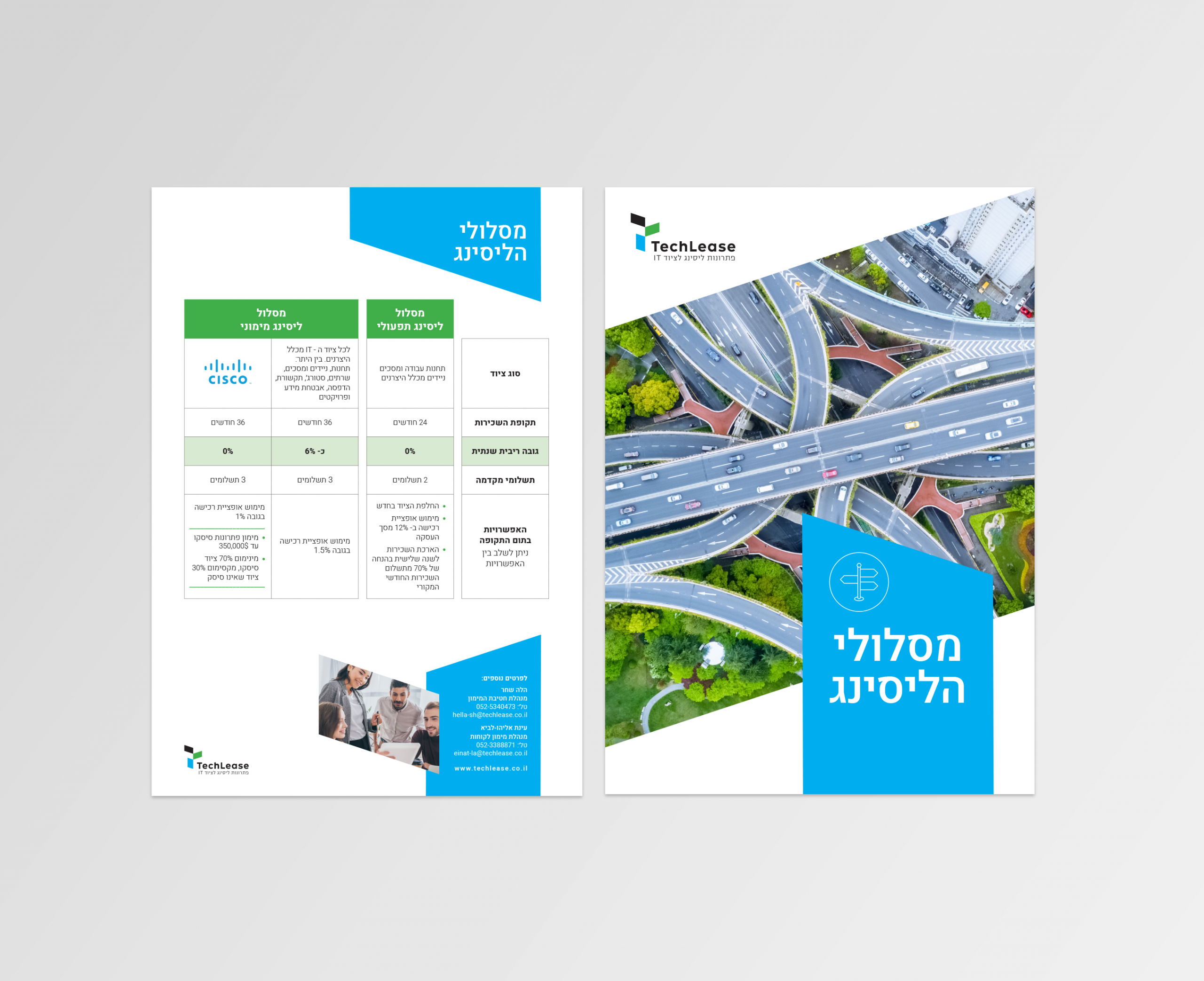
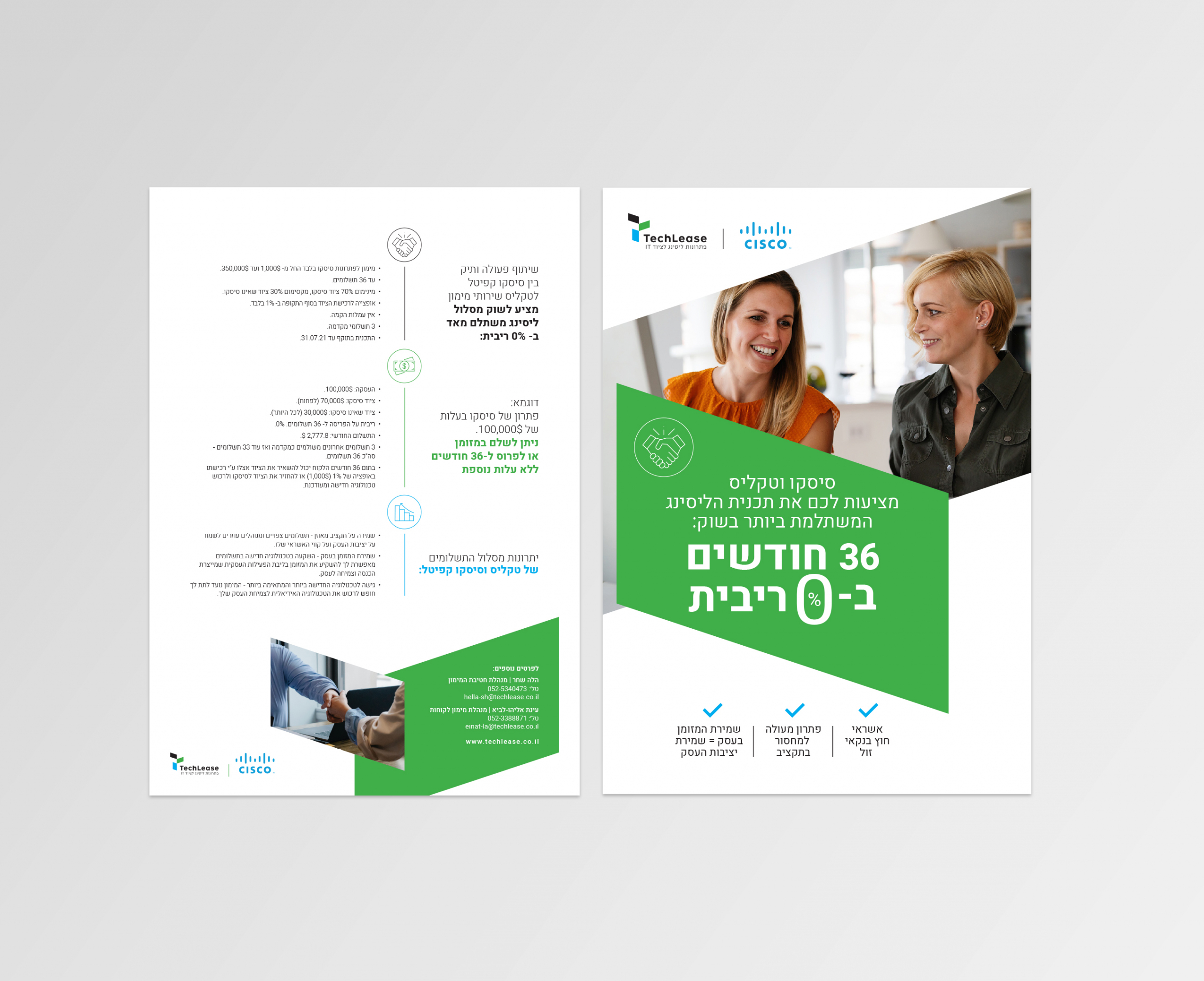
Marketing Brochures
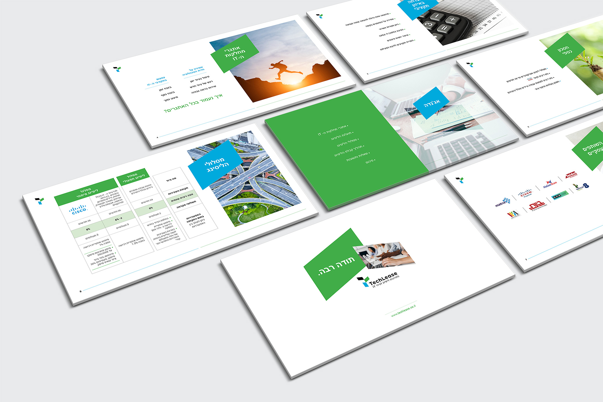
Microsoft PPT Design
In this project, we were asked by Techlease to design their company PPT presentation. We were glad to be a part of the process from the early stage of defining the purpose and goal of the presentation, through creating the design and up to the technical step of building a branded, yet functional and user-friendly PPT file.

